While my po
|
|
|
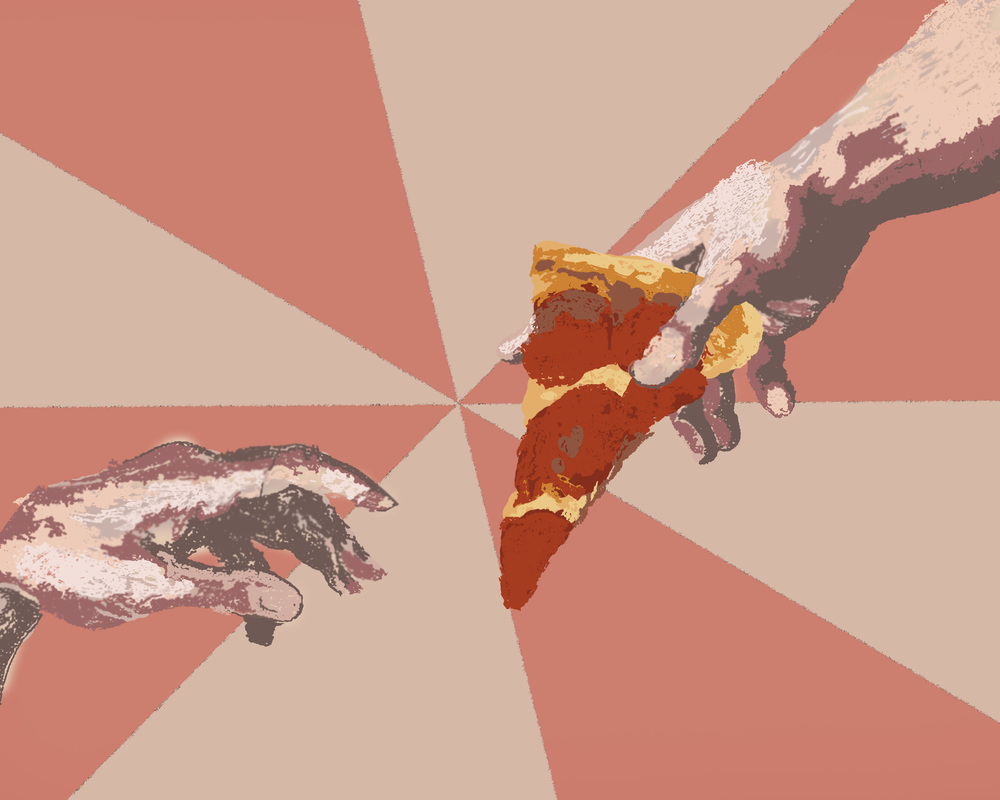
While traditional art (specifically drawing) is something I am very good at, I have never been successful at creating digital artwork. I would like to create a "painting" using photoshop. The goal is not for it to look realistic, but for it to be able to pass as a painting. I would like to create a narrative scene (the subject matter is still to be determined). Hopefully, I will come out of this project with the ability to paint in photoshop as well as a better understanding of all its tools.
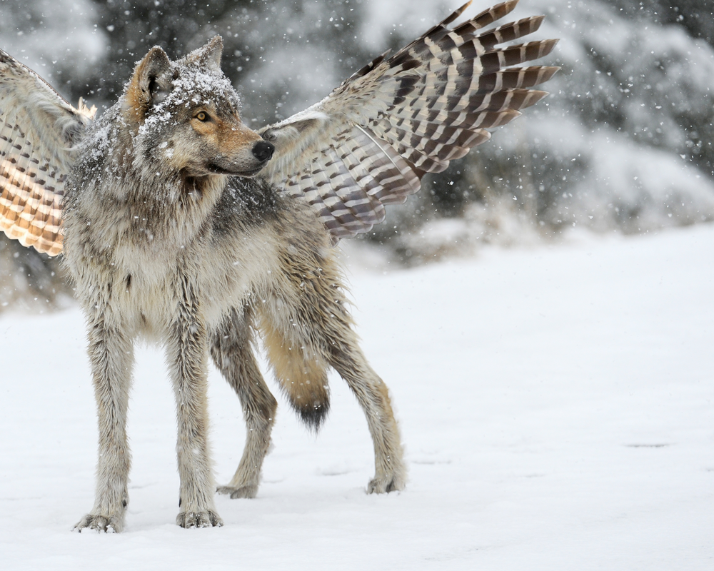
The Lupine Volaticus (a rough Greek translation for "winged wolf") is the combination of two ultimate predators.
To create this animal, I mostly used layering and erasers. I cut the wings from my owl image and placed them where I wanted them as a top layer. I then used several different kinds of erasers at varying opacities and erased the wings, letting the fur show through. To finish, I used the blur tool on the wings to make the fur less harsh.
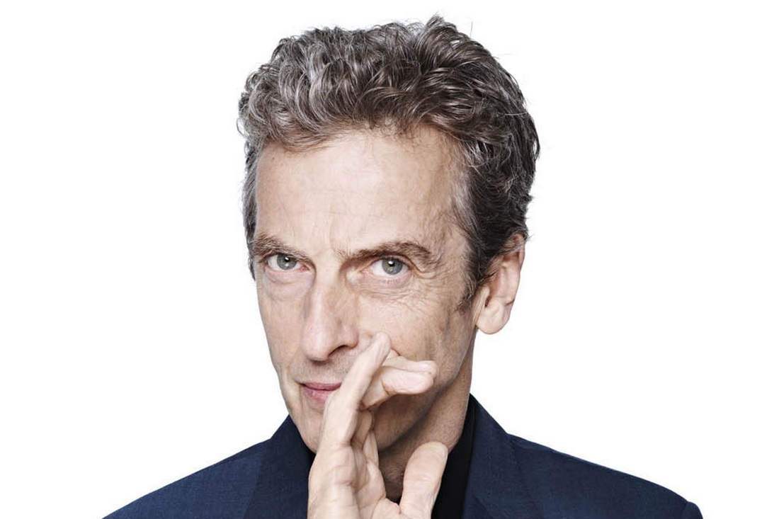
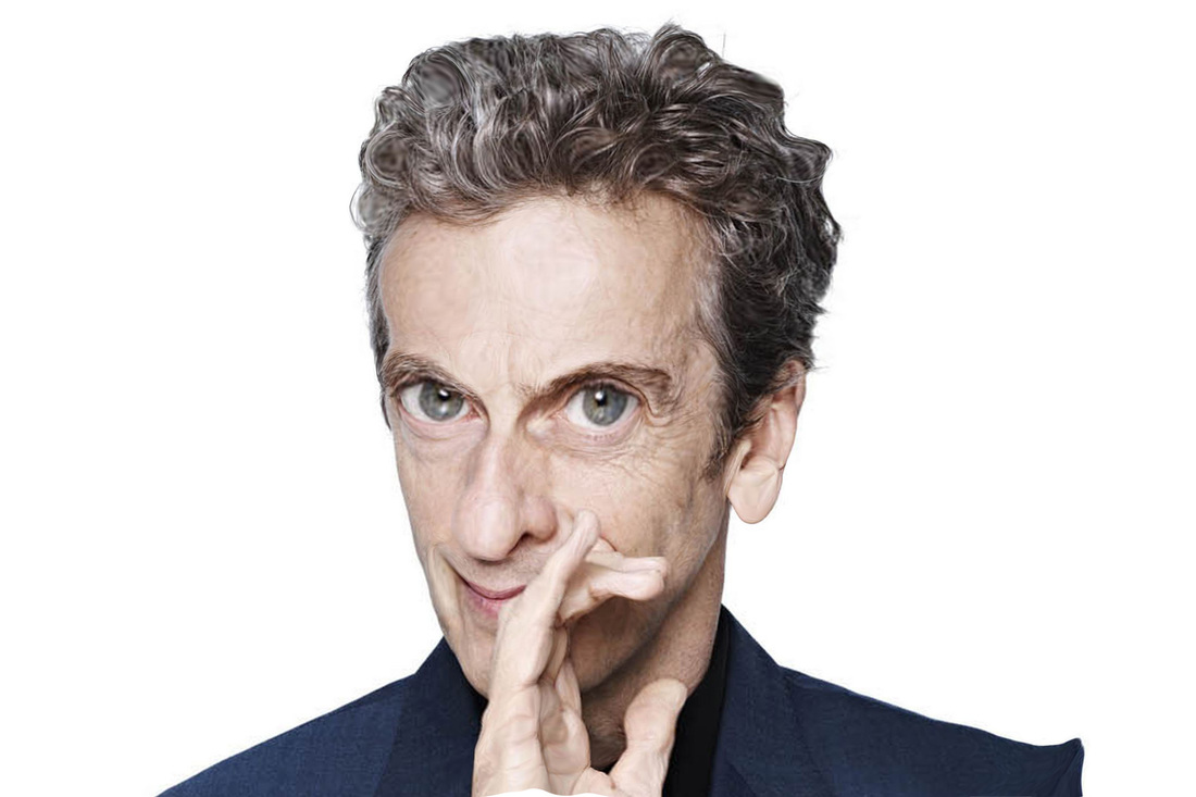
Using the liquify tool is always a hit-or-miss for me. I generally dislike changing just the face, as I feel it should still look slightly humanoid in the end, and thus I feel restricted. The full body, however, was quite fun to do. I decided to make Peter Capaldi look like he was melting, and had quite a good time using the different tools to create this effect.
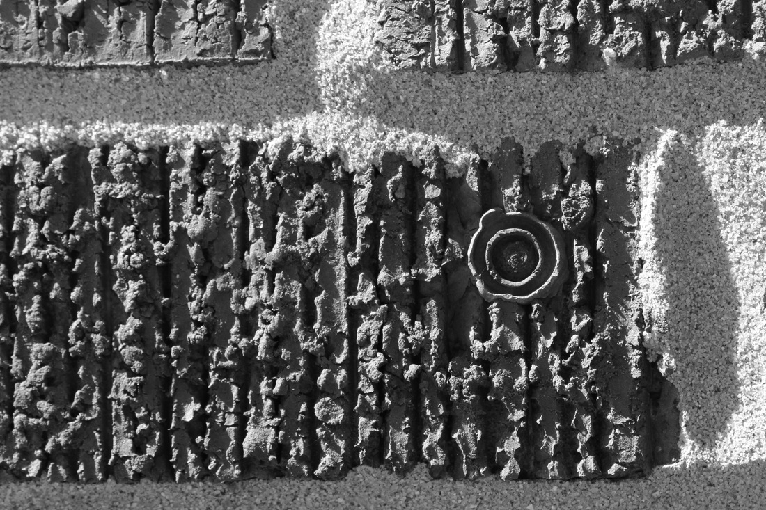
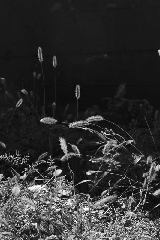
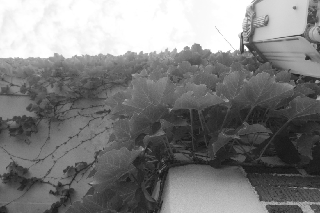
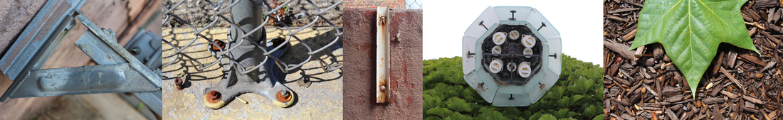
I believe that my strongest image is my "rough" image, as both the ratio of dark-to-light space and the composition of the diagonals is very good. I also think the extreme amount of texture in the foreground of the photo adds a lot of interest. I believe my weakest photo is my "soft" photo, as there is a lack of contrast and the leaves are not as sharp as I would like them to be. This assignment was about creating a mood using the manual camera settings (ISO, aperture, and shutter speed). The image that was the hardest to capture was the "Heavenly and cheerful" (top right), because I spent some time trying to capture a lens flare (which I naturally did accidentally in several of my other photos), but eventually gave up.
My favorite of the four photos is my "Dark and Moody" (bottom left) mostly because it was a happy accident. I had been recently shooting directly into the sun, and didn't have time to change my settings before the kids were out of my sight. The resulting image looks as though they are walking at night under a street lamp, when in reality, they are in broad daylight. I feel that the best-captured photo (in terms of saturation, focus, and lighting) was my "Warm and Inviting" (top left). I now feel much more comfortable using these manual settings, and I am sure I will grow more confident and deft the more I use them. 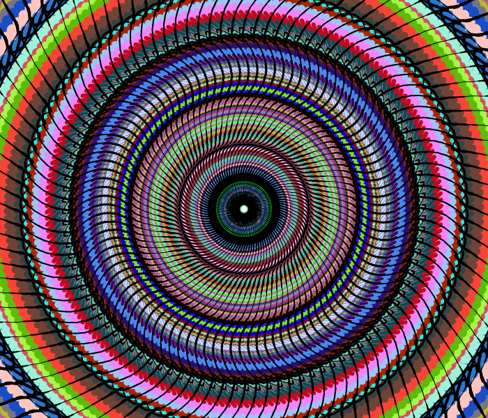 While in sumo paint, I played around a lot with fractals and gradients, but the final image I created using the symmetry function.
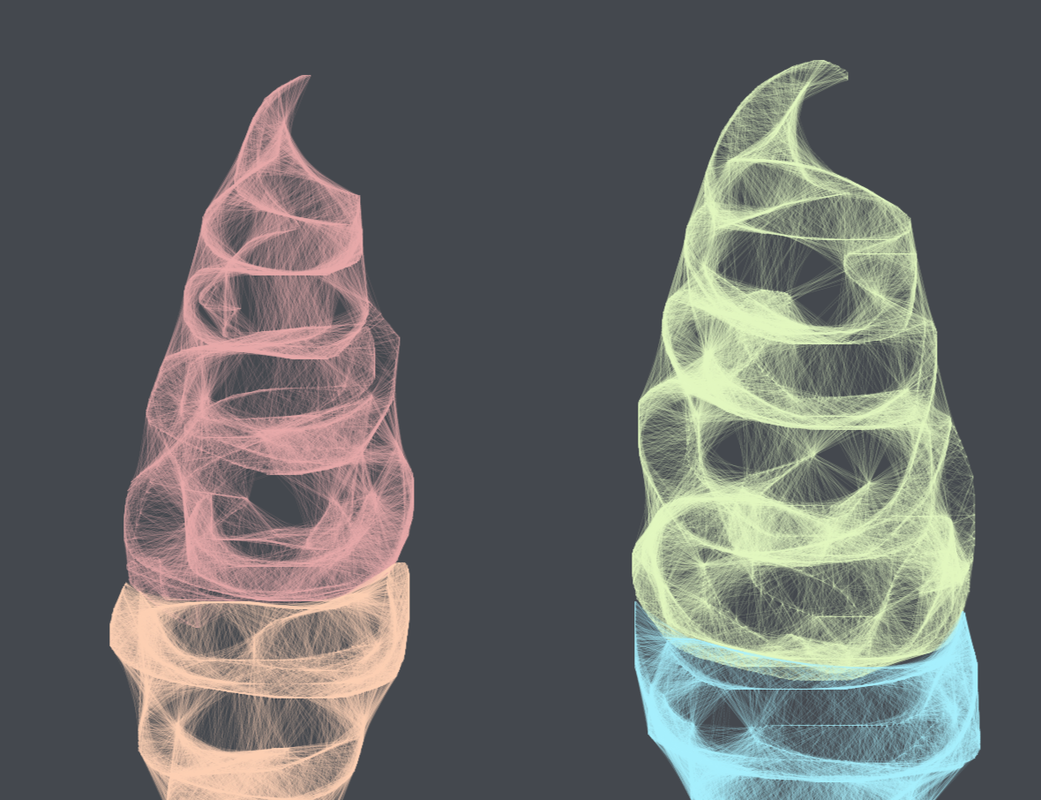
This image was created using the "web" tool which I thoroughly enjoyed learning how to use. With the program in general, I wish there was a layers option, and that there were more textures for the brushes. But overall, the program was easy to use and contained several cool features.
|
Archives
April 2015
Categories |


 RSS Feed
